
Blue, purple and red: BMW Motorsport
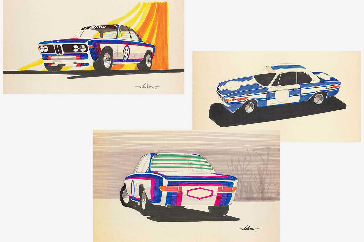
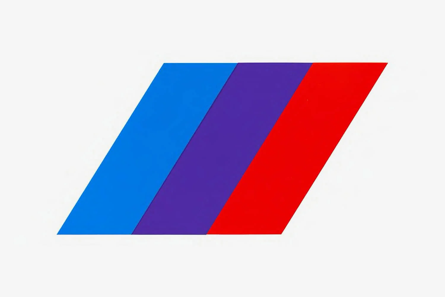

BMW Motorsport was founded in 1972 as a business unit for the sporty products of the BMW brand. It wasn't until 1993 that it became BMW M. The newly created sports car division was meant to combine and professionalise BMW’s racing activities under a single, unified corporate identity. The unifying element for all of this was to be a crisp colour scheme. BMW interior designer, Wolfgang Seehaus, was part of the team in charge of it, and he was the one who created the BMW M colours of blue, violet and red. Blue stands for BMW, red for motorsport and violet for the unique combination of the two.
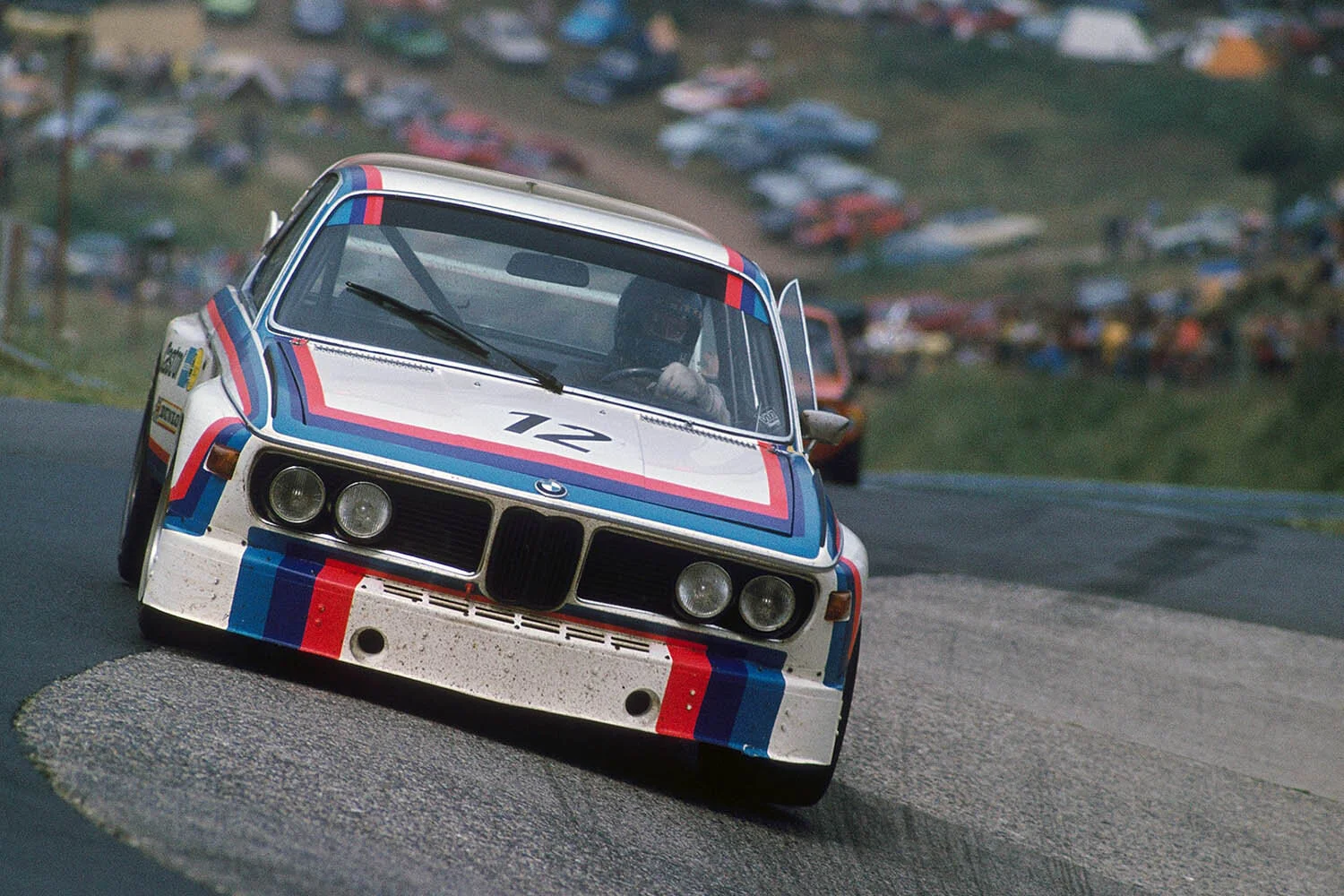
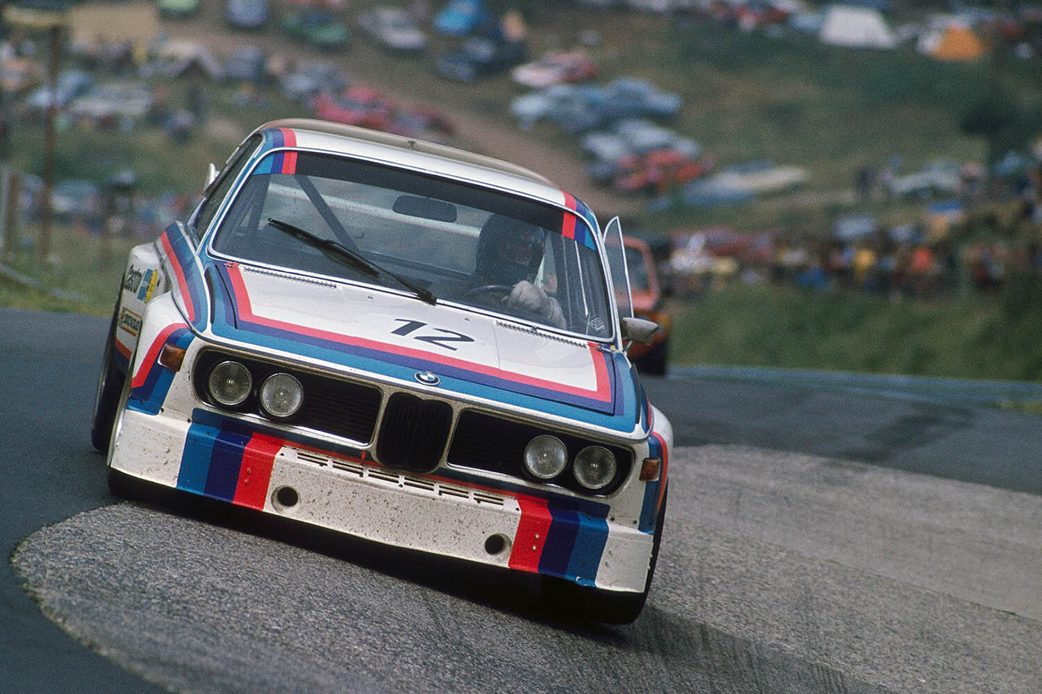
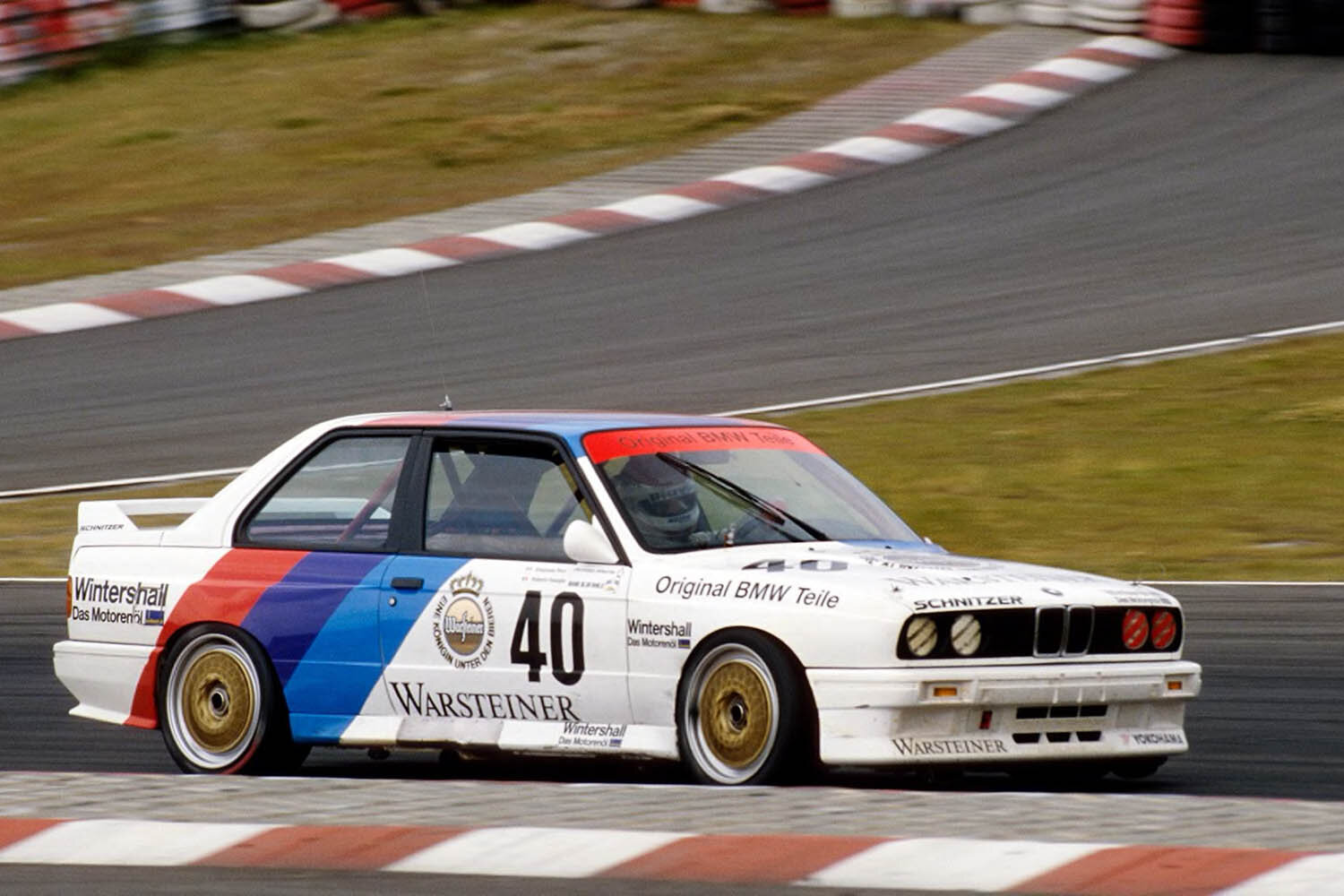
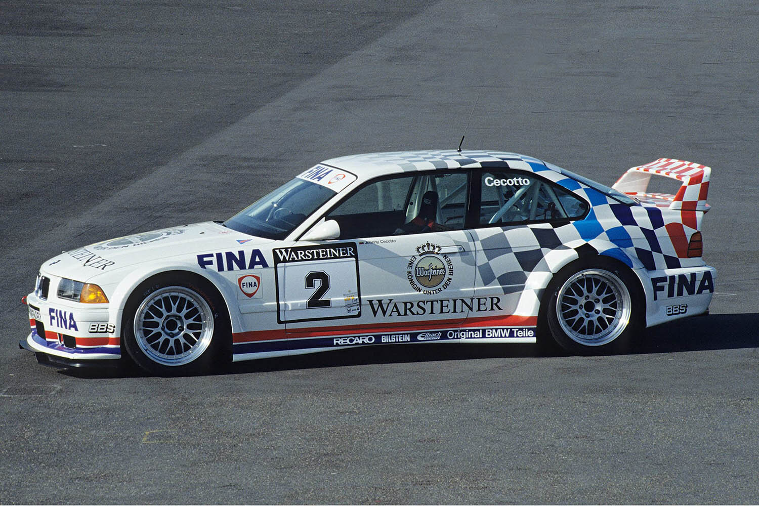
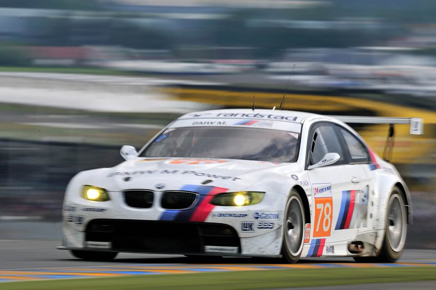
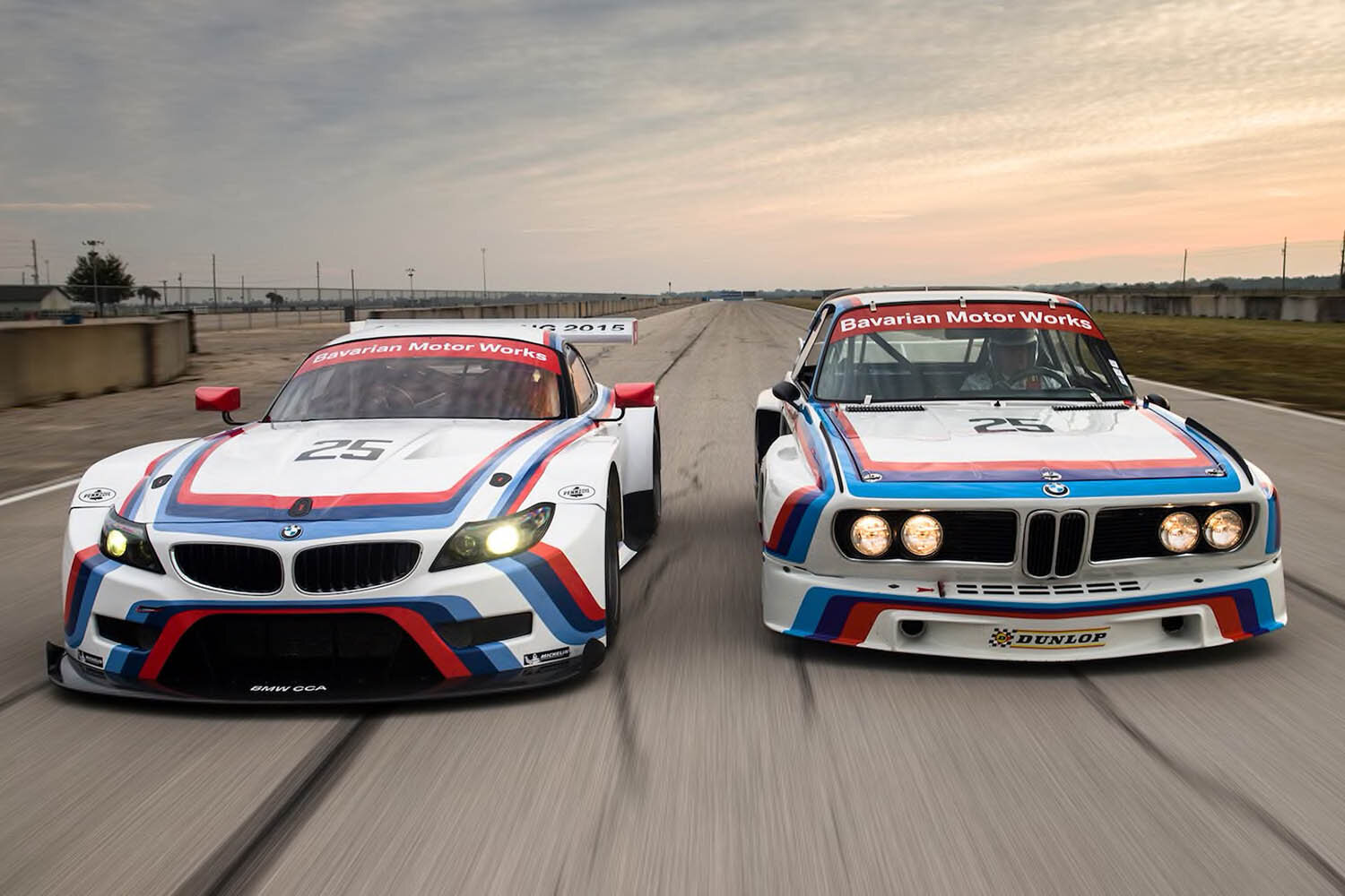
The tricolour M logo quickly found its way onto the racing cars of Bayerische Motoren Werke. The striking colour design was given its racing debut in 1973 on the BMW 3.0 CSL, which would also go on to become a BMW icon as a result. Graphic designer Pierre Mendell was responsible for the vehicle’s final design in cooperation with BMW designer Manfred Rennen. To this day, the performance cars in the racing division still sport the renowned M colours in various sizes and designs.

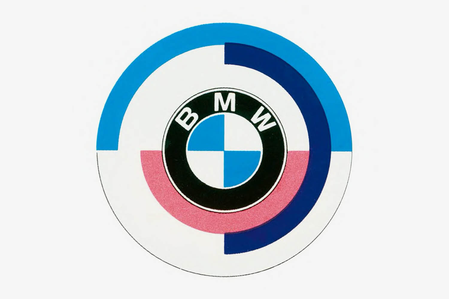
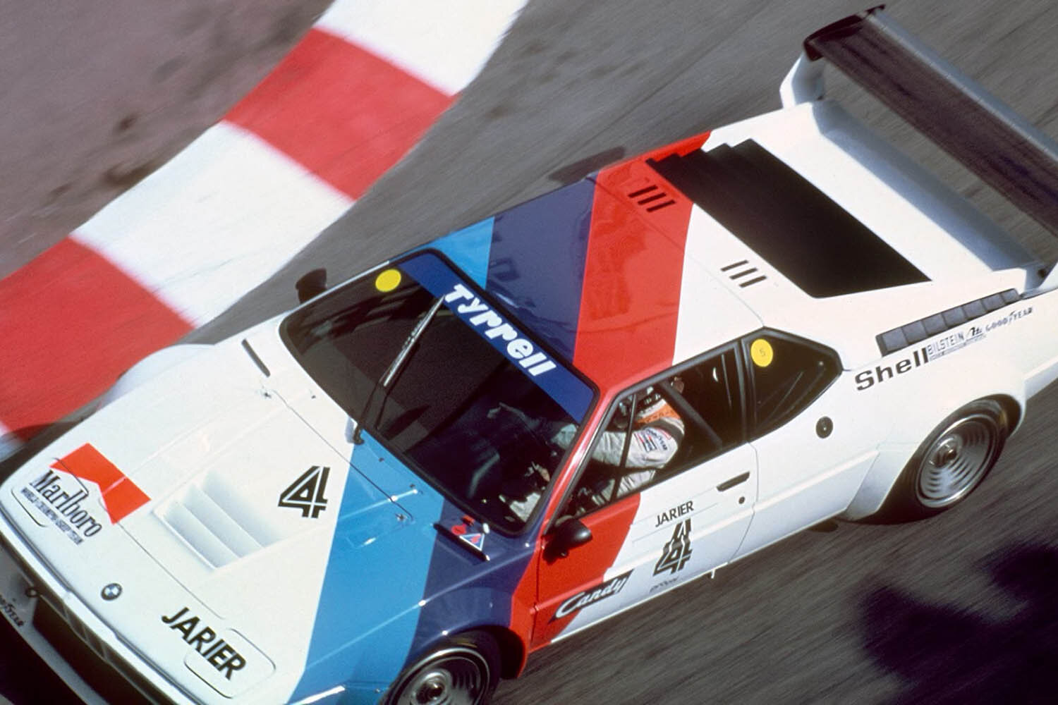
What is often forgotten is that the BMW M blue, violet and red colour scheme has been around much longer than the combination of these colours with the “M” itself. Whereas the colours were used from 1973 onwards, it wasn’t until 1978 that the letter “M” was incorporated into the logo with the launch of the BMW M1 – the first car to be developed by BMW Motorsport. Since then, the tricolour scheme and the “M” have always been used together and are emblazoned on all BMW M vehicles. BMW has been using the BMW logo, including variations on segments in concentric circles, since 1973. The design for this initial BMW motorsport emblem originated from the Swiss graphic design agency Müller.

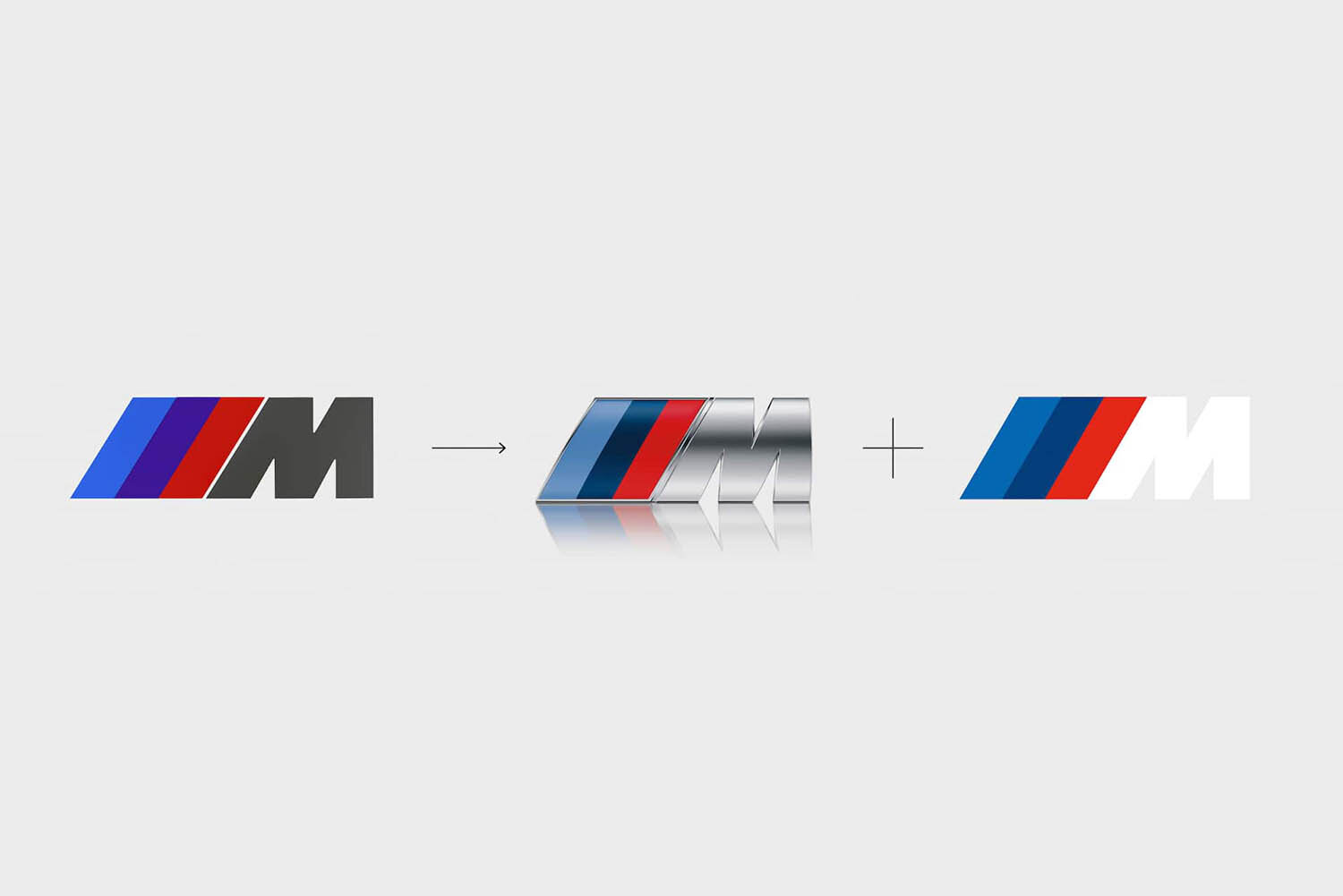
The legendary BMW M power logo, used since 1978, features the three stripes leaning against the M, intending to emphasise the speed and dynamism of the BMW M series. Conceived by design studio Italdesign under the direction of Giorgio Giugiaro, it is also known as the “Giugiaro M”.

Over the years, the design of the M logo and the M stripes has been carefully refined, with the colour purple changed to a dark blue, for example. The most recent update to the corporate design was made in March 2020 and since then the BMW M communication logo has been sporting its new look solely for brand communication. It is now two-dimensional as opposed to three, and features four colours – light blue, dark blue, red and a white “M”.
Photos © BMW